


Overview
As Universum’s in-house UX/UI designer, I led the design of a company-wide digital transformation across three connected products, the marketing website, the CareerTest survey that fuels the business, and the client-facing Insights Platform that delivers its data. I owned UX and UI end to end, working across brand, product, engineering, data, and sales to turn a fragmented, ageing digital presence into one coherent, on-brand, data-driven experience.
- Company website: Rebuilt an ageing WordPress site on the headless CMS Storyblok. Structured around Universum’s highest-value searches, it reached the first page of Google for most of them and became a lead-generating showcase of the company’s data rather than a static brochure.
- CareerTest survey: Redesigned the survey and its result page end to end to lift completion rates and give users a richer reason to finish, lowering the cost of one of Universum’s largest expenses: data collection.
- Insights Platform: Reshaped a young, fast-built product into a modern, self-serve platform through client research, a brand-aligned UI, reworked navigation and filtering, and new insights modules clients can act on.
- Across all three: Built and maintained tokenised design systems in Figma as a single source of truth, keeping tight parity between what was designed and what shipped.
The company
Universum is one of the world’s most established employer-branding and talent-insights firms. Founded in 1988 in Stockholm, it surveys anywhere from a quarter of a million to over a million students and professionals across the globe each year to understand what talent wants from employers. That research powers Universum’s Most Attractive Employer rankings and the insights it sells to employers worldwide, making data collection and data delivery the core of the business.
The challenge
Universum’s digital presence had become fragmented over time. The company website was an ageing WordPress build that no longer reflected the brand or showcased the depth of data the company had to offer. CareerTest, the survey that feeds the entire business, needed a stronger experience to keep completion rates high and data-collection costs low. Finally, the client-facing Insights Platform was a young product where UX and UI had been a lower priority than migrating the physical delivery to it. The goal across all three: one coherent, on-brand, data-driven experience.
My role
I was the in-house UX/UI designer responsible for the design of all three products, from research and wireframes through to polished UI. For the website I also acted as both product owner and UX engineer, sharing responsibility for front-end implementation and CMS configuration with the developers. I worked closely with product managers, engineers, data scientists, sales, and marketing to help turn Universum’s business goals and data into usable interfaces.
Tools & approach
Figma was my main design tool, where I built and maintained tokenised design systems for all three products. This helped keep the work structured and much easier to implement, acting as a single source of truth, speeding up design and hand-off, and ensuring tight parity between design and code to ensure what shipped was what was designed.
For the company website I extended this into UX-engineering, configuring the CMS Storyblok and using Claude Code with the Figma MCP to take my designs straight into production code myself.
To identify issues and pain points, I conducted in-depth interviews and user testing with internal stakeholders as well as external parties, like CareerTest users and Universum Insights platform clients.
I set up behavioural tracking with Mixpanel on CareerTest and Matomo on the company website. Finally, I supported other departments, like digital marketing, by producing visuals, video assets, and social-media ad templates in Canva, Photoshop, and After Effects.
Company website
The problem
The corporate site was a dated WordPress build. The page loaded slowly, it no longer matched Universum’s brand, and it hid the breadth of ranking and insights data behind a structure that did little to help prospective clients discover Universum’s offering or get in touch with sales.
Approach & solution
I rebuilt and redesigned the site from scratch, structuring its information architecture and responsive layouts around what mattered most to a visitor. The result is a fully responsive site aligned to the refreshed Universum brand, with an expanded rankings and insights section at its heart.
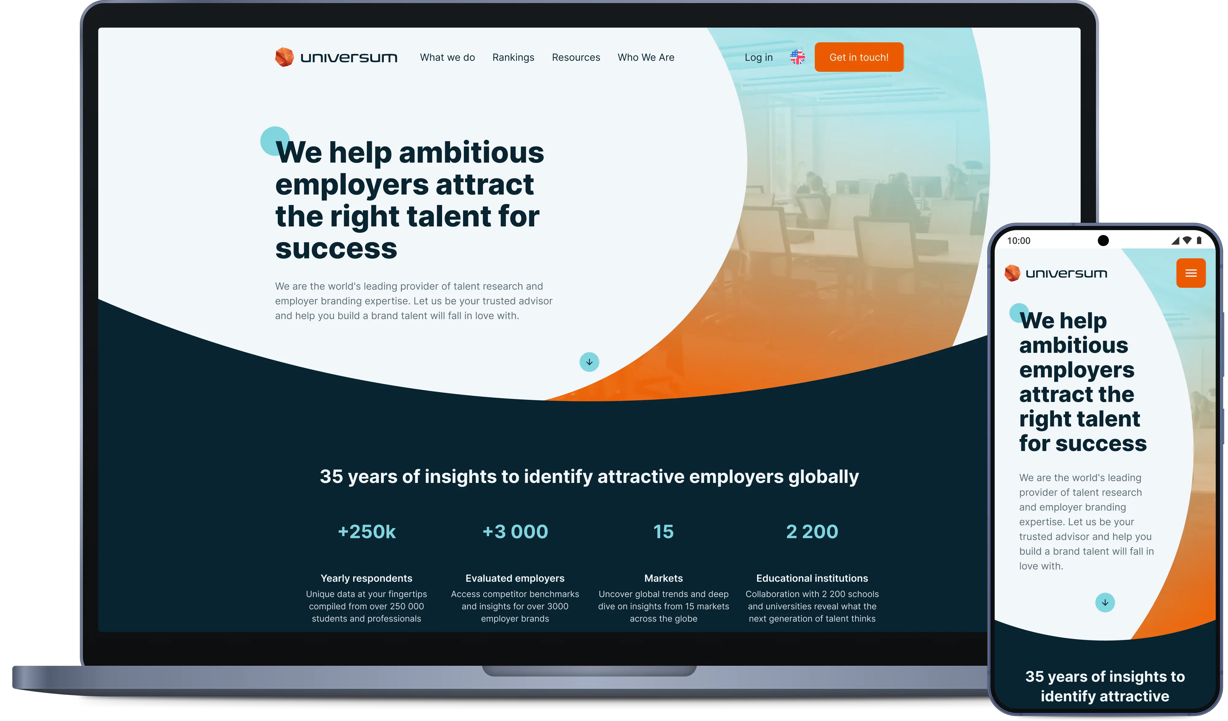
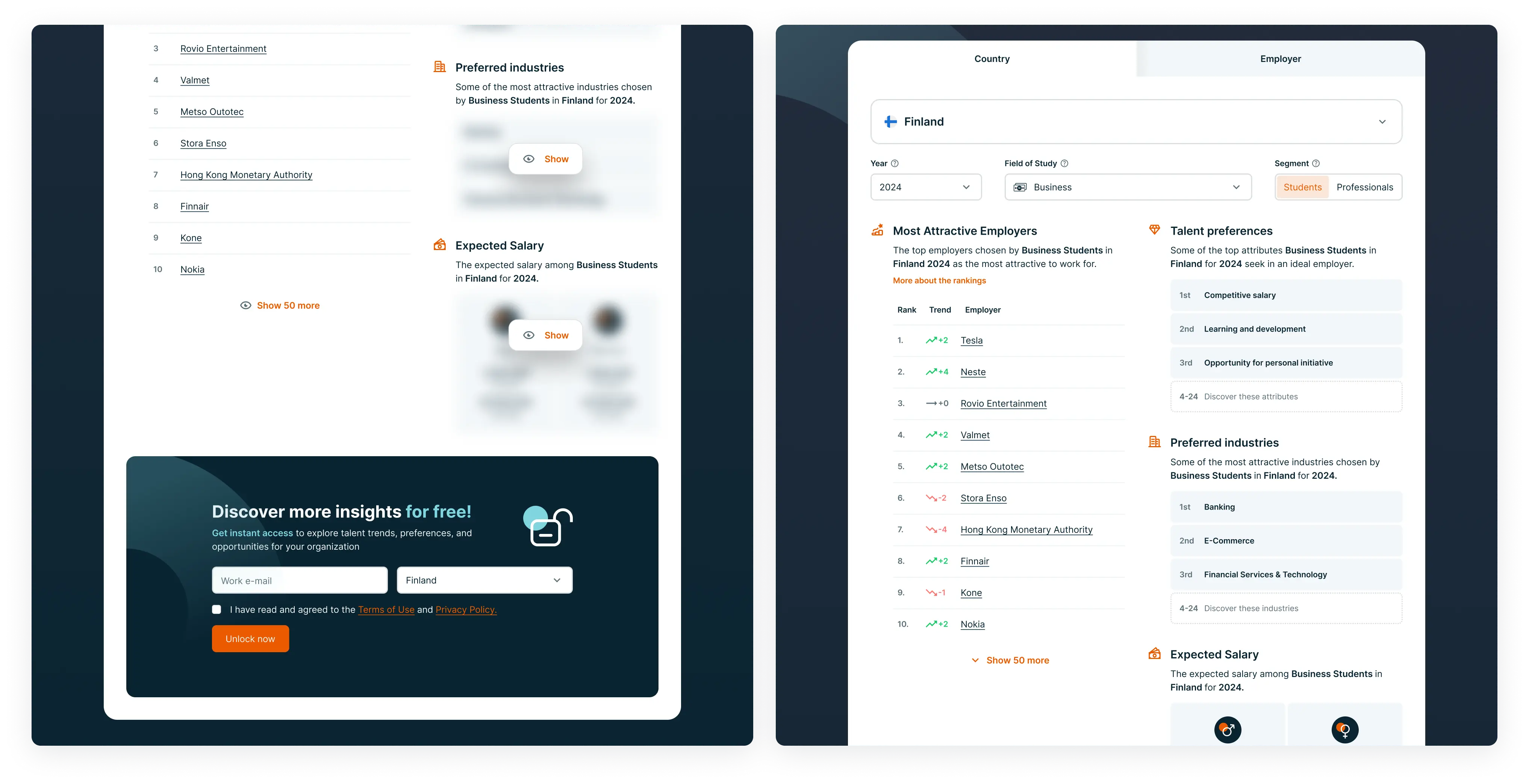
Prospective clients can browse the rankings, explore the data Universum holds, and move naturally towards contacting sales, transforming the old website’s data table of rankings into a lead-generating showcase of the company’s data.
Rebuilding on Storyblok, a headless CMS, in place of the old WordPress also gave a far more flexible, component-based way to build and update pages, making everyday content work faster and much less reliant on developers.
Outcome
The rebuilt site reached the first page of Google for most of Universum’s highest-value searches, a substantial improvement in organic discoverability over the old site. It also increased the number of leads generated, largely thanks to the improved rankings and insights section.
CareerTest
CareerTest is the survey the entire business is built on. Users answer questions about what they want from an ideal employer. When they finish, they reach a result page showing them one of five Career Types, along with advice on how to navigate their career, employer recommendations matched to their preferences, salary insights, and more. Every test feeds Universum’s data and rankings, so the quality of this experience directly affects the cost and volume of the company’s most important asset.
The problem
Data collection is one of Universum’s largest expenses, and the old CareerTest experience left value on the table: visuals and usability of the survey didn’t encourage completion, and the result page didn’t provide enough reason to feel the test had been worth their time. A weaker experience means lower completion, fewer organic shares, and more negative sentiment, all of which mean more spend to gather the same data.
Approach & solution
I redesigned CareerTest end to end, working two problems at once: a smoother, more engaging path through the survey to lift completion, and a far richer, data-driven result page to reward users for finishing.
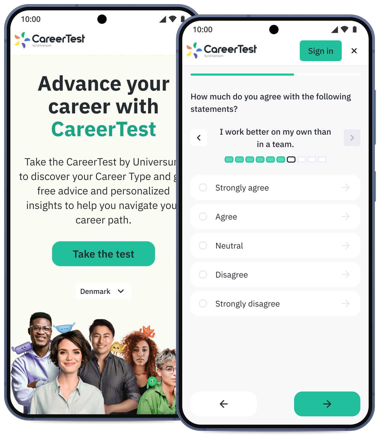
I refreshed the survey visuals and improved the UX to minimise churn. Together with the data scientists I also helped restructure questions with high drop-off rates. To push completions higher, I ran regular A/B experiments on gamification and retention features.
Drawing on Universum’s large body of talent data, I expanded the result page with additional content to give each user more meaningful, personalised insights into their career type, salary expectations, matching employers, and more. Together with the improved visuals it created an experience that was both more interesting and meaningful than before. I also set up in-depth event tracking in Mixpanel to follow the real user journey, see where people dropped off, and keep finding points to improve.
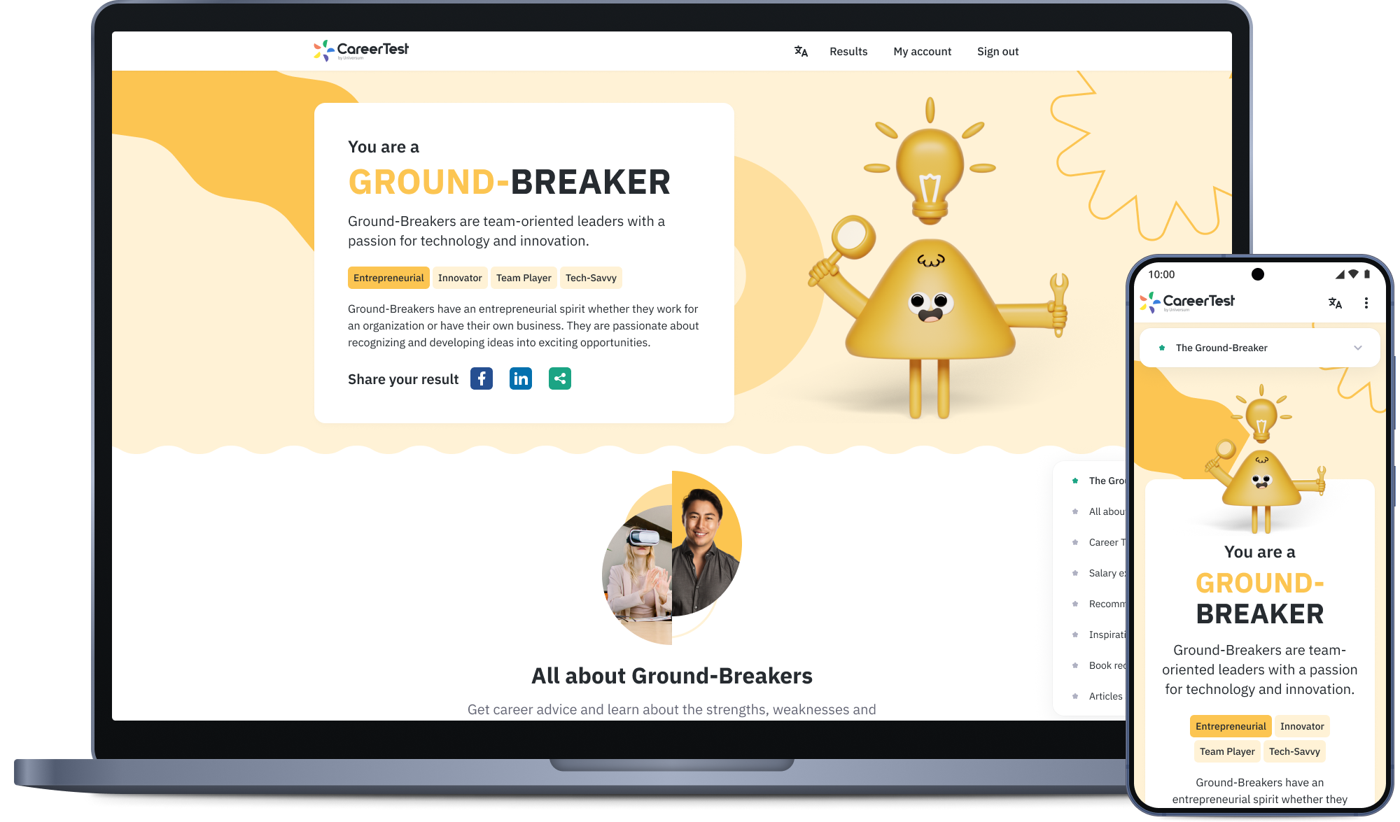
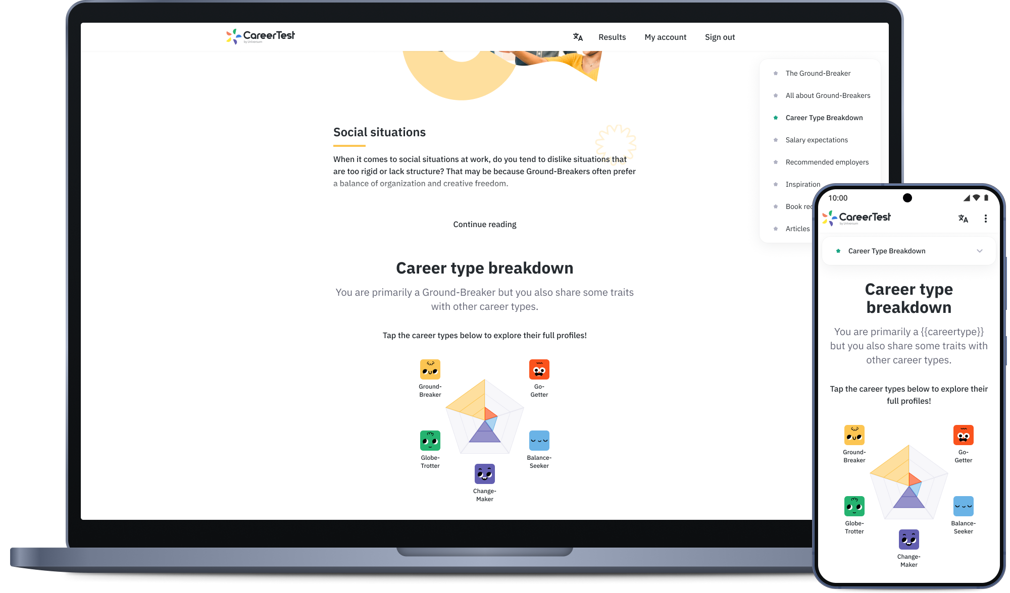
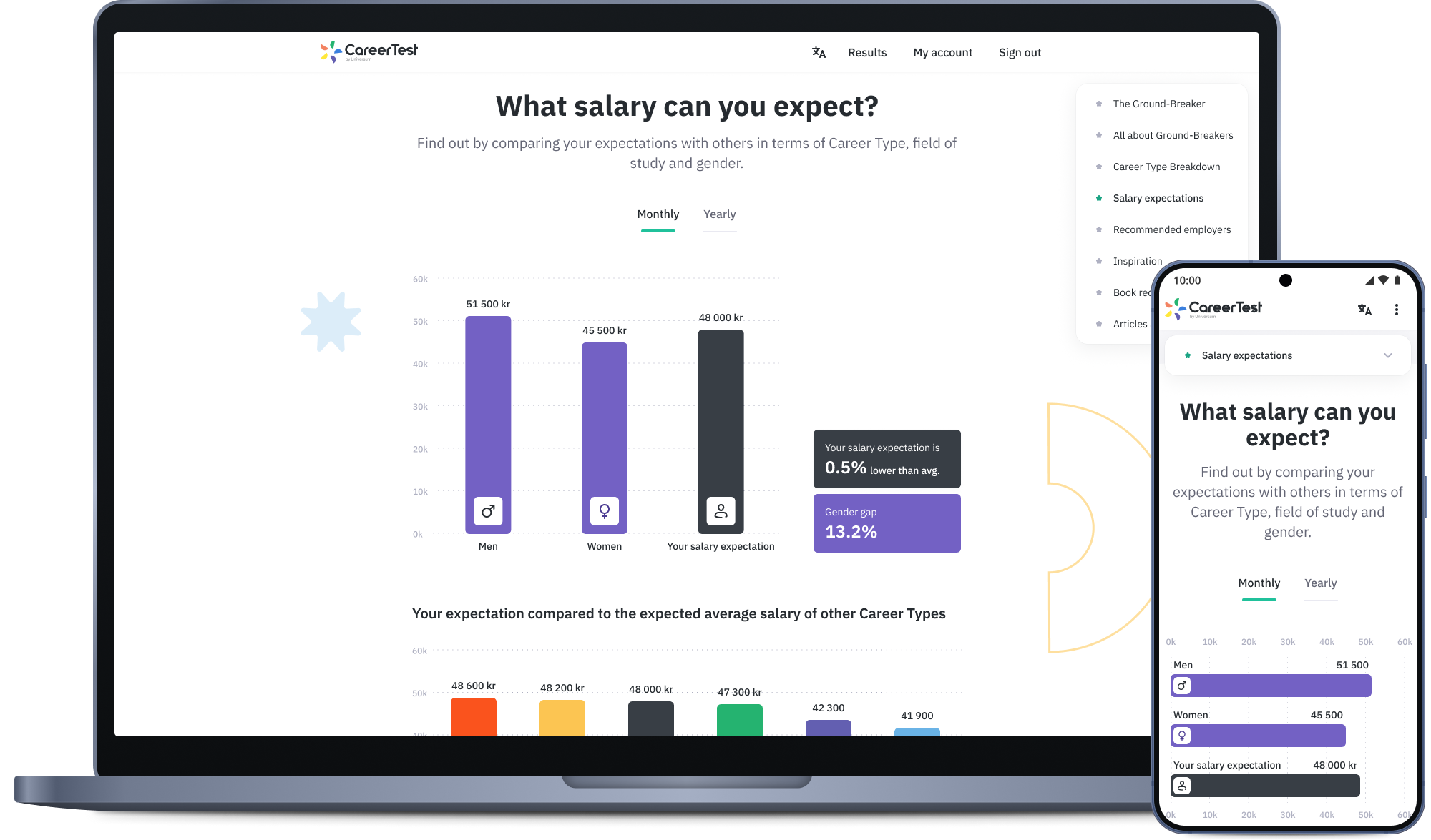
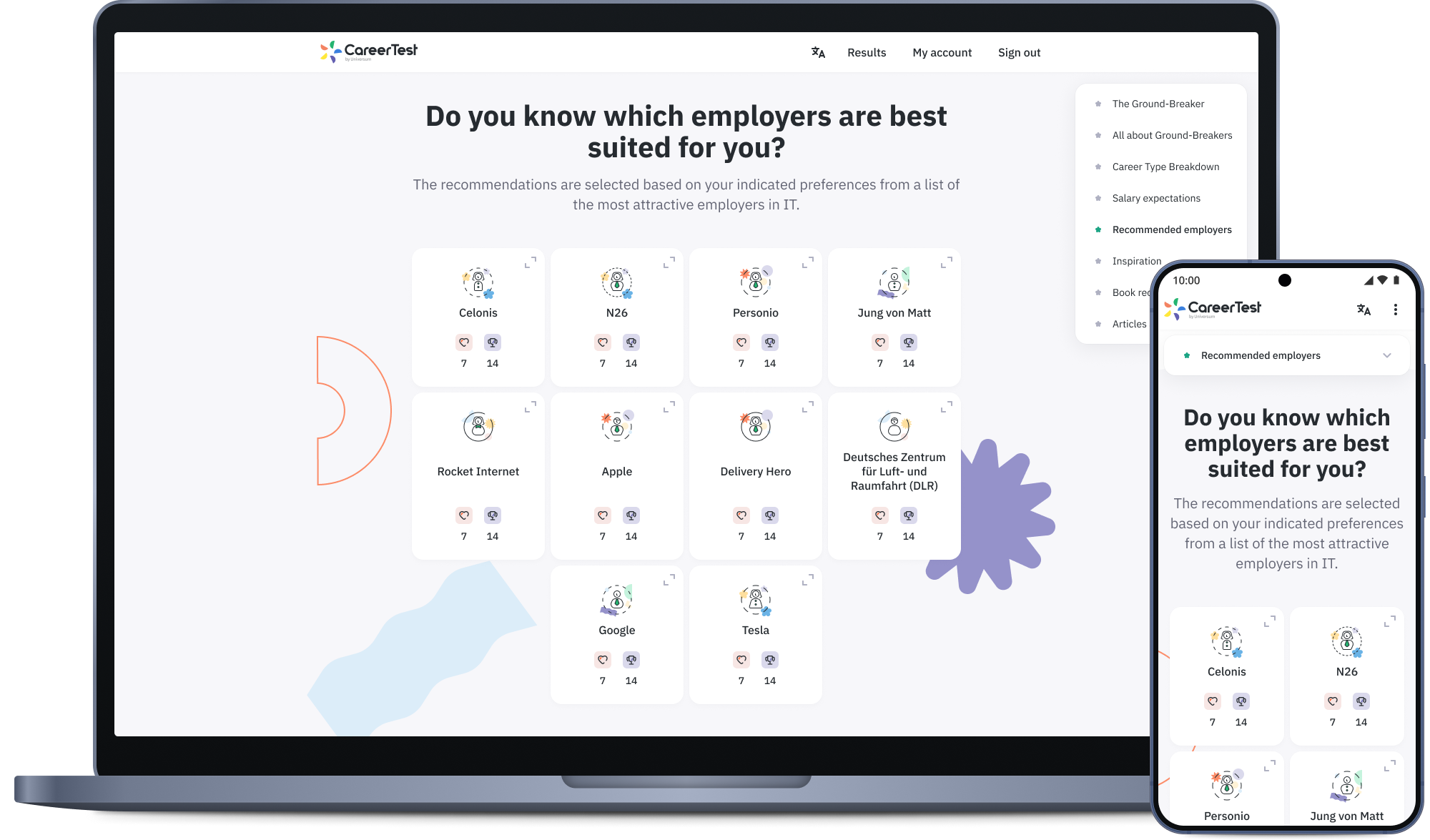
Finally, I supported the digital marketing team by creating image and video ad templates for social media, matching the refreshed look and feel and highlighting the new result page content being offered.
Outcome
The redesign improved conversion, with more users completing the test, which lowered the cost of one of Universum’s biggest expenses, data collection. User satisfaction with the result-page content improved markedly which contributed to more organic shares, and the Mixpanel tracking gave the team an in-depth view of the user journey to guide further improvements.
Universum Insights Platform
The Insights Platform is where Universum’s clients access the data they’ve purchased. The delivery end of the business, used by HR and employer-branding teams to explore talent preferences, brand image, competitor benchmarking, and rankings. As Universum moved towards a digital-first delivery, the platform had to become a modern, self-serve product clients could navigate on their own.
The problem
The Insights Platform was a young product, built up fast, where the priority had been migrating the data and insights from physical delivery as Universum shifted towards a digital-first approach, resulting in UX and UI being a secondary focus. The platform’s UI had drifted from the Universum brand and its navigation, page structure, and obscure filtering made it hard for clients to find and act on their data. With delivery going digital-first, the experience had to carry more weight than ever.
Approach & solution
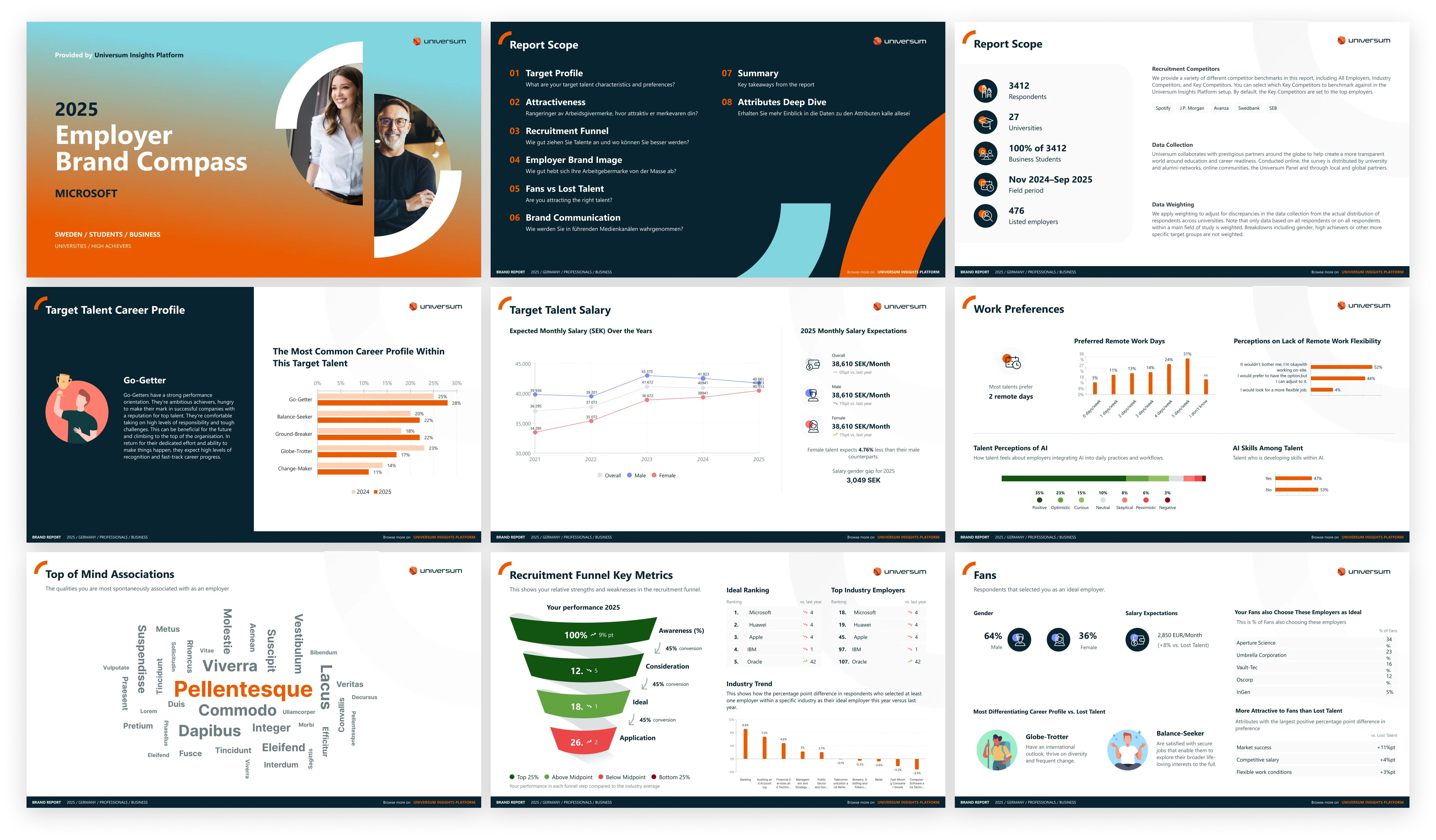
I conducted in-depth interviews with several clients, both power users and those who only used the platform occasionally, to learn about their needs and pain points. I also talked extensively with the product owner, sales, and other internal stakeholders to understand their perspectives. Based on the feedback, I realigned both the platform UI and the exportable PowerPoint with the Universum brand and reworked the navigation and page structure around how clients used the platform when looking for answers.
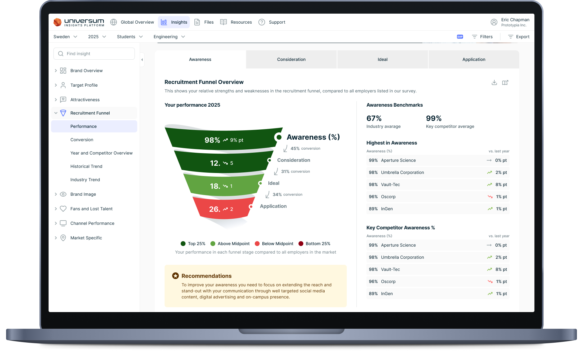
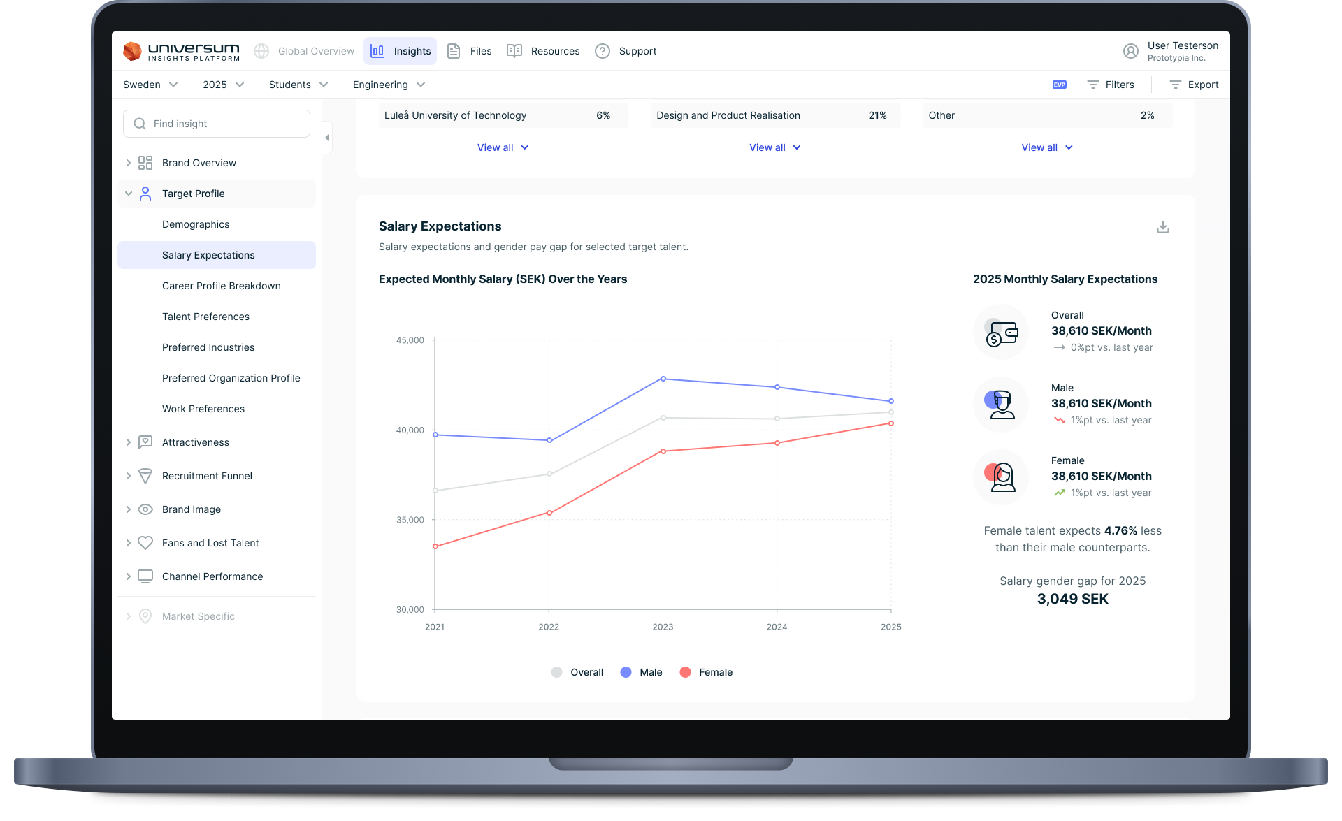
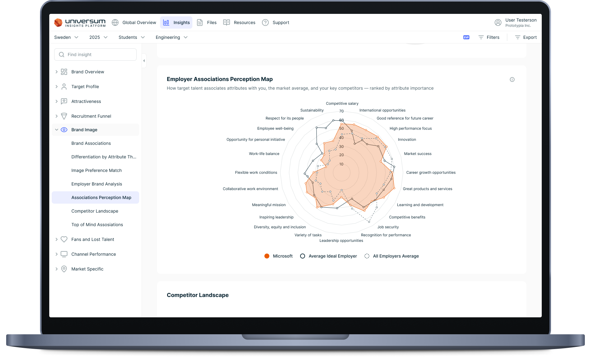
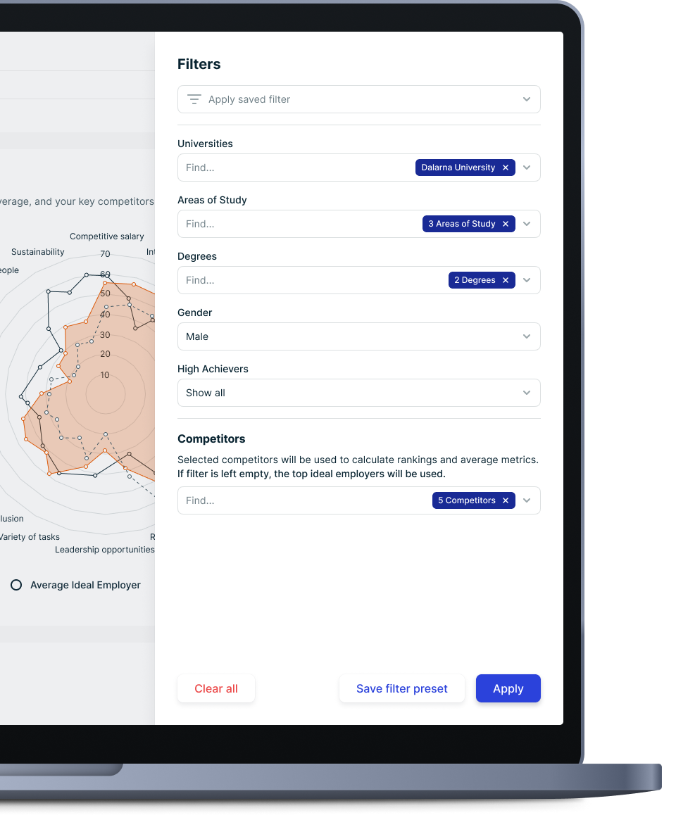
I redesigned and expanded the filters and moved them in a side panel to make them available from everywhere in the platform. The improved filters allowed clients to easily explore and slice the data by the dimensions that mattered to them.
Working closely with stakeholders and data engineers, I shaped and designed several new insights modules that packaged the raw data into clear, actionable stories and redesigned and expanded several existing ones to better serve the clients’ needs. The result is a modern, on-brand, self-serve platform that helps clients get to their insight without needing to contact their key account manager to guide them through the process.
Outcome
The redesigned platform made it easier for clients to explore their data, and the new modules made Universum’s insights easier to act on. Feedback from sales indicated that client satisfaction with the platform is steadily rising, and the improved and new insight modules gave key account managers additional tools they could use while selling to clients.
Reflection
Working across all three products gave me an end-to-end view of a data business, from the survey that collects the data, to the website that markets it, to the platform that delivers it to clients. The through-line was the same each time: take something complex and data-heavy and repackage it into something that is clear, on-brand, and genuinely useful to its users.
A big takeaway is how much of design happens before the first wireframe. To design any one of these products well, you first had to understand the business as a whole: where the data comes from, the cost to collect it, how it is packaged and sold, and how it fits together. Understanding those connections is what allowed me to prioritise the work that had the most impact rather than what was simply most visible.
That understanding can only come from talking to people in very different roles. Internally I worked with product managers, engineers, data scientists, sales, marketing, brand, and key account managers, each of whom held a different piece of the puzzle and what they considered to be most important. Externally I interviewed clients, from power users to occasional ones, and listened to the students and professionals taking CareerTest. Learning to ask the right questions of each group and reconcile conflicting priorities into one coherent direction turned out to be just as central as anything I did in Figma.